Sunday, 10 March 2013
Costume
Damian (the star) - He wears casual clothes as appropriate for the indie genre. Jeans, t-shirt, hoodie, and he also wears a gillet as they are very fashionable at the moment. The costume was carefully thought about and inspired by the many indie music videos I watched as part of my research. All the costumes are very similar making it a convention of a indie music video which we decided to adhere to.

Prop List
Guitar - for the performance aspect of the video
Mobile phone - for Ashleigh
A sign with a message on it - narrative aspect
Mobile phone - for Ashleigh
A sign with a message on it - narrative aspect
Monday, 14 January 2013
My Magazine Advert - progress

This is my rough cut Magazine Advert. From the feedback I have received it is clear that I need to experiment more with colour and font of the text to make it more visually exciting. I have however received positive feedback for the layout of the design as well as the inclusion of the mini reviews (which I found from my research to be a convention of music magazine adverts) and the iconic social pictures in the bottom right hand corner were very effective (this to was inspired by research). The blank space in the middle is for a picture of our main character. By puting him central the audiences eyes will be automatically drawn to him creating a star image and a connection between star and audience. I have also included an image of our vibrant and vivid album cover to help promote the album. It is a very visually appealing picture that I'm sure will draw the audiences in.
There is still a little bit of work to be done however the audience feedback I received on this magazine advert has been very helpful in guiding me to a more conventional and professional looking magazine advert. I will change the colour of some of the text and also experiment more with the font. I think the basis and foundations for this advert is strong though; all I need to do now is act upon feedback and further develop.
Magazine advert - Research
Magazine adverts promoting albums conventionally have either the picture of the arist or an image of the album front cover. This is a predominant picture that grabs the audiences gaze and attention. I intend to have have a picture of both the album cover and the artist. This is however less common but if done effectively it looks profession and interesting. I will of course show a rough cut and ask an audience for feedback. If I find that its not effective I will choose between the album cover or the artist. Having the artist on the magazine advert creates a star image and is conventional for solo artists. Research suggests that bands tend to use a background of their album cover instead of including all the members.


This is an example of an album advert in a magazine which has used the album front cover as its main feature. There are other little conventions used in this, like the release date and the play.com logo advertising and informing the public where they can buy/download this album. I think its very effective and eye-grabbing. Bands usually use artwork as their album front cover as their individual fame is all equal to the band. The band is more of a symbol than they can be individually.

Again this is an example of an album advert that has used the album front cover as its predominant image however the image is of the Florence. The use of this picture creates a "Star Image" for Florence and promotes her in a good light.
This is an example of a music advert that uses a picture of the "star" as opposed to the album front cover. This technique is usually done for solo artists.
Research is the key to creating a professional looking magazine advert promoting our artists new album. I felt it was important to adhere to some of the obvious conventions so the public will immediately recognize it as a music magazine advert. However it is also important to challenge some aspects and experiment with the positioning of the images as well as what you decide to include.

This is a rare example of a magazine advert that uses an image of the band/individual artists as well as a separate image of their actual album front cover. This is what I will try to imitate.
Thursday, 6 December 2012
Digipak - What is a digipak?
A digipak is a style of CD packaging. It consists of a front and back cover with the addition of other features. We will be making a 6 panel digipak. As well as a front and back cover, we will also have a page with image of the artist and a page with the lyrics to the song. We decided to include these due to the research we had undergone earlier. This is very common, especially for indie/acoustic artists and seeing as our artist/song falls under the indie/acoustic genre we felt it was suitable. Due to the 'digital age' consumers tend to download their music thus losing out on this physical feature. They miss out on the interesting additions artists put decide to put in their digipaks.
Florence Welch from "Florence + the Machine"had included a booklet in her album full of lyrics and the interesting stories behind the making of the songs. Its something you can't experience through a download.
Florence Welch from "Florence + the Machine"had included a booklet in her album full of lyrics and the interesting stories behind the making of the songs. Its something you can't experience through a download.
Digipak - Album Cover Ideas

This is the original picture we decided to use for our CD front cover. Due to our research into indie/acoustic album, we felt that this image worked really well. Indie/acoustic album covers tend to be more artistic, they usually don't have a picture of the artist so that is why we didn't either.

We experimented with different effects to make the image more interesting. This was done on Photoshop. This effect is called glowsticks under the stylised effect; it's something you would expect on an indie album cover. We also tried out different fonts and font colours. We decided that this font was the best, and out of all the colours we used, white looked best with this particular effect.

This was another possible idea however due to the darkness and effect, the multi-colours are less visible/bright therefore its less "eye grabbing", we feel the original image grabs the attention more which is key.
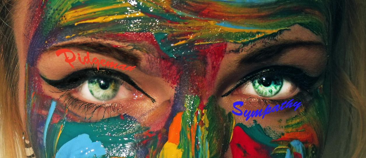
This image is close to the original however we have brightened her eyes to make it more appealing. This isn't the particular image we'll use because the font is hard to read due to the colour of the font and the many colours already in the image. It is also too close to the original, we feel it should be more edited, in terms of altering the image via effects.

The white font works better here as well, so as a group we decided on using this font in white, no matter what edit we finally decided to use.
First Edit
We presented the first edit of our music video, this is the feedback we got. We will use this to improve on the things that the audience felt needed work on.
How would you rate our music video?
Excellent: 2
Good: 7
Ok: 0
Poor: 0
Our audiences felt that our music video is generally "good" which means their is definitely room for improvement and refinement. Two of our audience rated it "excellent" which is pleasing however we would agree with the majority. We feel that we will definitely need to film more "narrative" footage as the general view was that its more interesting than the performance.
What are the strengths of our music video?
Performance: 3
Editing: 4
Lighting: 2
Lip sync: 7
Narrative: 7
Star image: 5
It is clear that our music video has many strengths however we feel like we have too much performance and nit enough narrative. The majority of our audience felt that the narrative and lip synching were our biggest strengths so we will play to them.
How can we improve our music video?
More performance: 0
Fine tune editing: 6
Improve lip sync: 0
Lighting: 2
Other: 1
It is clear that we need to fine tune our editing. With more narrative footage it will give us more scope and opportunity to have shorter clips; this will make it more interesting.
Primarily, our audience felt that our music video suited the song which is essential. This means that we are on the right tracks and the changes/alterations we have to make aren't drastic.
How would you rate our music video?
Excellent: 2
Good: 7
Ok: 0
Poor: 0
Our audiences felt that our music video is generally "good" which means their is definitely room for improvement and refinement. Two of our audience rated it "excellent" which is pleasing however we would agree with the majority. We feel that we will definitely need to film more "narrative" footage as the general view was that its more interesting than the performance.
What are the strengths of our music video?
Performance: 3
Editing: 4
Lighting: 2
Lip sync: 7
Narrative: 7
Star image: 5
It is clear that our music video has many strengths however we feel like we have too much performance and nit enough narrative. The majority of our audience felt that the narrative and lip synching were our biggest strengths so we will play to them.
How can we improve our music video?
More performance: 0
Fine tune editing: 6
Improve lip sync: 0
Lighting: 2
Other: 1
It is clear that we need to fine tune our editing. With more narrative footage it will give us more scope and opportunity to have shorter clips; this will make it more interesting.
Does the music video suit the music track?
Yes: 9
No: 0
Subscribe to:
Posts (Atom)