A digipak is a style of CD packaging. It consists of a front and back cover with the addition of other features. We will be making a 6 panel digipak. As well as a front and back cover, we will also have a page with image of the artist and a page with the lyrics to the song. We decided to include these due to the research we had undergone earlier. This is very common, especially for indie/acoustic artists and seeing as our artist/song falls under the indie/acoustic genre we felt it was suitable. Due to the 'digital age' consumers tend to download their music thus losing out on this physical feature. They miss out on the interesting additions artists put decide to put in their digipaks.
Florence Welch from "Florence + the Machine"had included a booklet in her album full of lyrics and the interesting stories behind the making of the songs. Its something you can't experience through a download.
Thursday, 6 December 2012
Digipak - Album Cover Ideas

This is the original picture we decided to use for our CD front cover. Due to our research into indie/acoustic album, we felt that this image worked really well. Indie/acoustic album covers tend to be more artistic, they usually don't have a picture of the artist so that is why we didn't either.

We experimented with different effects to make the image more interesting. This was done on Photoshop. This effect is called glowsticks under the stylised effect; it's something you would expect on an indie album cover. We also tried out different fonts and font colours. We decided that this font was the best, and out of all the colours we used, white looked best with this particular effect.

This was another possible idea however due to the darkness and effect, the multi-colours are less visible/bright therefore its less "eye grabbing", we feel the original image grabs the attention more which is key.
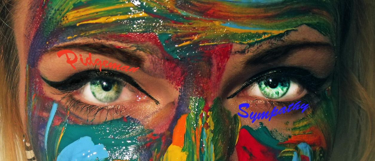
This image is close to the original however we have brightened her eyes to make it more appealing. This isn't the particular image we'll use because the font is hard to read due to the colour of the font and the many colours already in the image. It is also too close to the original, we feel it should be more edited, in terms of altering the image via effects.

The white font works better here as well, so as a group we decided on using this font in white, no matter what edit we finally decided to use.
First Edit
We presented the first edit of our music video, this is the feedback we got. We will use this to improve on the things that the audience felt needed work on.
How would you rate our music video?
Excellent: 2
Good: 7
Ok: 0
Poor: 0
Our audiences felt that our music video is generally "good" which means their is definitely room for improvement and refinement. Two of our audience rated it "excellent" which is pleasing however we would agree with the majority. We feel that we will definitely need to film more "narrative" footage as the general view was that its more interesting than the performance.
What are the strengths of our music video?
Performance: 3
Editing: 4
Lighting: 2
Lip sync: 7
Narrative: 7
Star image: 5
It is clear that our music video has many strengths however we feel like we have too much performance and nit enough narrative. The majority of our audience felt that the narrative and lip synching were our biggest strengths so we will play to them.
How can we improve our music video?
More performance: 0
Fine tune editing: 6
Improve lip sync: 0
Lighting: 2
Other: 1
It is clear that we need to fine tune our editing. With more narrative footage it will give us more scope and opportunity to have shorter clips; this will make it more interesting.
Primarily, our audience felt that our music video suited the song which is essential. This means that we are on the right tracks and the changes/alterations we have to make aren't drastic.
How would you rate our music video?
Excellent: 2
Good: 7
Ok: 0
Poor: 0
Our audiences felt that our music video is generally "good" which means their is definitely room for improvement and refinement. Two of our audience rated it "excellent" which is pleasing however we would agree with the majority. We feel that we will definitely need to film more "narrative" footage as the general view was that its more interesting than the performance.
What are the strengths of our music video?
Performance: 3
Editing: 4
Lighting: 2
Lip sync: 7
Narrative: 7
Star image: 5
It is clear that our music video has many strengths however we feel like we have too much performance and nit enough narrative. The majority of our audience felt that the narrative and lip synching were our biggest strengths so we will play to them.
How can we improve our music video?
More performance: 0
Fine tune editing: 6
Improve lip sync: 0
Lighting: 2
Other: 1
It is clear that we need to fine tune our editing. With more narrative footage it will give us more scope and opportunity to have shorter clips; this will make it more interesting.
Does the music video suit the music track?
Yes: 9
No: 0
Tuesday, 9 October 2012
The Jonas Brothers - Star Images Music Videos
In many aspects, The Jonas Brothers music videos possess key conventions to make the videos feel and look like a typical music video which is what I want to re-create so I will use some of their techniques. Some key techniques they use are the use of close-ups, variety of shots and the editing which is cut to the beat. These videos are performance based, which is typical and conventional of boy bands, with aspects of narrative which makes it more effective and interesting. They give very energetic performances and their movement adds to the performance.The lighting which is used is soft lighting, mainly achieved through artificial lighting which is what Ill be using in the performance part of my video. I will have artificial back and front lighting with reflectors to give it a softer touch.
Star Image - The Jonas Brothers
The Jonas Brothers - Album Covers

This is there artwork from there debut album; this is early on so there image and style reflects their youth. The clothing, jeans, t-shirt and hoodie suggest their youth and maybe hints at the rebellious and fun side to them. Their whole stance is very "cool" and so is the fact that they have their hands in their pockets; it makes them look "laid back" and again, "cool". I think the colours work well, the black and white on the red makes the album cover really stand out, possibly to reflect the band standing out from your average boy band. I think this album cover represents their image and music at that particular time (2006). This would probably appeal more to the female audience, and maybe the boys that aspire to be like them.

This is the artwork off of their second album. The smart clothing and fancy font suggest maturity from their last album. This could symbolise a change in their music but what it definitely is, is a change of image for the brothers. The lack of colour and the gold font also suggest a more mature star image. They are directly looking into the camera thus instantly making a connection with the audience and its a slight low angle making them seem more powerful. I would say this is aimed for girls, perhaps targeting older girls than they did with their last album cover.

Not much change in image in terms of this album cover. Again they're in very suave attire. Due to the lack of colour again, the red really stand out. There isn't much change from their last album however from their first album, there certainly is a progression and from beginning to now the change in image has helped them stay current.

The use of white and brown gives it a masculine quality. Its slightly more colourful than previous albums however they've kept the fancy font to give it class. Their clothing is what you would also call "fashionable". This again is aimed at girls; the direct address via looking into the camera and medium close-up shots creates an instinct connection with the girls. Girls would consider the Jonas Brothers to be heart throbs.


Monday, 1 October 2012
Questionnaire
1) How clear were our ideas presented via our treatment?
1 2 3 4 5 6 7 8 9 10
Very unclear Very clear
Average score = 8.3
2) What did you think about the quality of our ideas?
1 2 3 4 5 6 7 8 9 10
Very poor Very good
Average score = 8
3) Would you agree that our treatment has covered every aspect?
1 2 3 4 5 6 7 8 9 10
Covered v.little Covered everything
Average score = 7.6
4) What do you think about our song choice?
1 2 3 4 5 6 7 8 9 10
Very bad Very good
Average score = 7.2
5) Do you think our vision for the music video fits the genre of the song we have chosen?
1 2 3 4 5 6 7 8 9 10
Doesn't fit at all Very Syutable
Average score = 8.4
6) Do you think we are targeting an appropriate target audience?
1 2 3 4 5 6 7 8 9 10
Inappropriate target audience Appropriate target audience
Average score = 8.6
7) Do you think we should add elements of performance?
1 2 3 4 5 6 7 8 9 10
Absolutely not Definitely yes
Average score = 8
8) What do you think of out narrative idea?
1 2 3 4 5 6 7 8 9 10
Awful Amazing
Average score = 8
9) Do you think our techniques for creating a star image will be effective?
1 2 3 4 5 6 7 8 9 10
Ineffective V.effective
Average score = 8.3
10) What do you think of our costume ideas?
1 2 3 4 5 6 7 8 9 10
Terrible Brilliant
Average score = 7.9
We distributed our questionnaire to 25 people and collated our results; we figured out the average of the results and used used it to work out what we did right and what we may need to improve on.
1 2 3 4 5 6 7 8 9 10
Very unclear Very clear
Average score = 8.3
2) What did you think about the quality of our ideas?
1 2 3 4 5 6 7 8 9 10
Very poor Very good
Average score = 8
3) Would you agree that our treatment has covered every aspect?
1 2 3 4 5 6 7 8 9 10
Covered v.little Covered everything
Average score = 7.6
4) What do you think about our song choice?
1 2 3 4 5 6 7 8 9 10
Very bad Very good
Average score = 7.2
5) Do you think our vision for the music video fits the genre of the song we have chosen?
1 2 3 4 5 6 7 8 9 10
Doesn't fit at all Very Syutable
Average score = 8.4
6) Do you think we are targeting an appropriate target audience?
1 2 3 4 5 6 7 8 9 10
Inappropriate target audience Appropriate target audience
Average score = 8.6
7) Do you think we should add elements of performance?
1 2 3 4 5 6 7 8 9 10
Absolutely not Definitely yes
Average score = 8
8) What do you think of out narrative idea?
1 2 3 4 5 6 7 8 9 10
Awful Amazing
Average score = 8
9) Do you think our techniques for creating a star image will be effective?
1 2 3 4 5 6 7 8 9 10
Ineffective V.effective
Average score = 8.3
10) What do you think of our costume ideas?
1 2 3 4 5 6 7 8 9 10
Terrible Brilliant
Average score = 7.9
We distributed our questionnaire to 25 people and collated our results; we figured out the average of the results and used used it to work out what we did right and what we may need to improve on.
Subscribe to:
Posts (Atom)